
By Lexie Lu
The call-to-action buttons (CTAs) on your website drive users toward the objective of the page. There are tons of competing suggestions for how to create a CTA with high conversions. Some experts advise using the color red for your call-to-action button, and others say the color doesn’t matter. Should you use first-person or second-person wording? Where should you place your call? All the different elements create confusion, but there are some tried and true rules you can count on for the best chance at success.
One study shows that a CTA click-through rate of 4.23% is average. If you aren’t nearing 4% for your conversions, it’s time to make some tweaks. When it comes to CTAs, there are many different things you can try to enhance their performance. Here are eight golden rules to follow to improve yours.
1. Design for Mobile
If someone accesses your site from a mobile device, how does your website respond? Are the call-to-action buttons easy to tap with a thumb? What about the placement of CTAs on the screen? Are they within easy reach of the person’s thumbs? How is the person’s identity verified? Many companies turn to non-password options to make logging in easier than ever before. Look for ways to make the user experience (UX) as simple as possible for your customers.
2. Make Buttons Look Clickable
Any element on your page should make the action the user takes clear. Show your call-to-action buttons are a clickable feature by adding words indicating the action. You can also add three-dimensional shadows to set it up from the rest of the page. Arrows and other indicators show which movement the user should take.
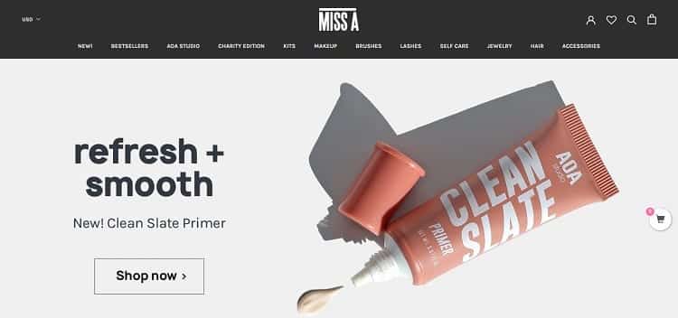
Miss A does several things to make it clear their button is clickable. The button is transparent, so the outline around it shows it is something of importance. They use the high action words “Shop Now.” They also include an arrow to indicate the user goes in another direction when clicking the button.
3. Pay Attention to Trends
Technology changes daily, so be aware of emerging trends and how they impact UX. For example, many people now use voice search. How does your CTA respond to voice requests? If someone accesses your site from a mobile device, how does your website respond? How are other sites using artificial intelligence (AI) to move the customer toward conversion?
4. Choose the Right Placement
Traditional wisdom says to place the call to action above the fold. However, this doesn’t work for every website. Some buyers need more convincing and want to read through trust indicators, such as testimonials, before buying. Choosing the right placement starts with knowing your target audience and how much information they need to move from the awareness to the decision stage in the buyer’s journey.

Aston Martin’s Red Bull Racing page features CTAs above the fold. The hero images fill the screen’s width, and the headline informs the user what they’re clicking on. As you scroll down, there are other CTAs, but they are clear buttons instead of the bold red. They’re also smaller, showing they aren’t the main focus of the site.
5. Rank Your CTAs
Some pages, like the Aston Martin example above, have more than one CTA on a landing page. Write out all the CTAs on a page and rank them in order of importance. What is the main goal for the page, and which button offers the highest chance of achieving the obstacle? Are there any you should delete? If they aren’t getting click-throughs and aren’t your primary focus, they should go. Simplify your page and keep the number of CTAs low.
6. Explain Where the Button Goes
If you faced two doors, and one said it entered the auditorium, and the other had no markings, you’d be reluctant to step through the unmarked entry. Let your site visitors know what happens when they click on your call-to-action buttons. Take away any doubt about if they go to a form or another page or a shopping cart. People don’t usually like surprises when it comes to CTAs.

Miista uses filtering as a call to action by shoe size. A filter as a CTA is a brilliant way to move buyers through the phases of the sales funnel very specifically. Since shoppers see what’s available in their size, it eliminates wasted time. Also, they know exactly where it goes because of the headline. You’ll find sale shoes in the size you click on.
7. Size the Button Correctly
There is a size hierarchy to elements on a page, with the most important ones being the largest. Think about how important the CTA button is. If it’s the absolute focus of your page, then it should be larger than any word in your text or other things. Perhaps your headline is most important and then your CTA. Make the headline the biggest feature, and the CTA the second biggest.
8. Surround the CTA with White Space
Negative space on your page helps draw attention to the CTA button. Set it off by itself, so the user’s eye lands on it. If you plan to use a see-through button on top of an image, make sure the image has one main shade in the area you plan to situate the element. An almost solid color helps the background blend into a negative space and draws the eye to the clickable area.
For a CTA to stand out and create conversions, you must focus on what you want the button to accomplish. Placement, colors, sizing, shadowing and transparency all depend on who your target audience is. Create your button based on their preferences and then test it to see which minor adjustments create higher click-through rates. With attention to detail, your CTA offers opportunities for reaching new leads.